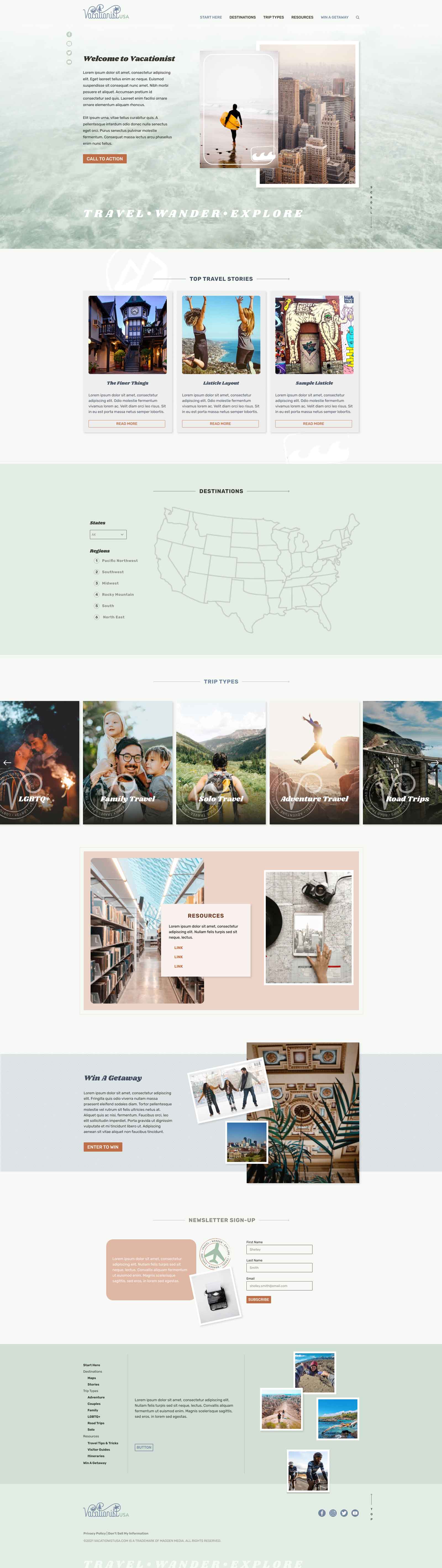
Website Re-design
In order to position VacationistUSA as a worthy travel resource, a site re-design and light re-brand were in order.
We maintained the existing logo and outfitted it with a new color palette of laid-back yet refreshing colors.
As head of the site re-design effort, I ran with the new colors, paired them with a chunky retro font, postcard-inspired stamp elements, and compelling travel photography to give visitors a rich online experience.
The experience is just as rich on mobile, with a few elements such as the regional map paired down, and all of the photography, texture, and stamp elements intact.
A simple mobile nav tops it all off, taking full advantage of the restructured sitemap, with easy access to travel categories and resources.